
With every new property we bring to the platform, the choice in the Resale market grows. This is great news for choice, but how do you choose from the vast array of options on offer? Read on to learn about an exciting new way open to you.
Property Partner has a relentless drive to foster and grow liquidity on its platform, which you can see for yourself in our Open House blog series, Data View in the Properties section of our website, and on the trading history graph of every property page.
This is paying off. Liquidity continues to improve dramatically across the platform, with £275,000 traded between investors in a single week earlier this month, and an increasing number of seller’s transactions executing immediately via the Bid engine.
But with a growing number of properties to choose from, the question is how to select which ones to invest in?
That’s your decision of course, but here’s a new tool you can use to help decide.
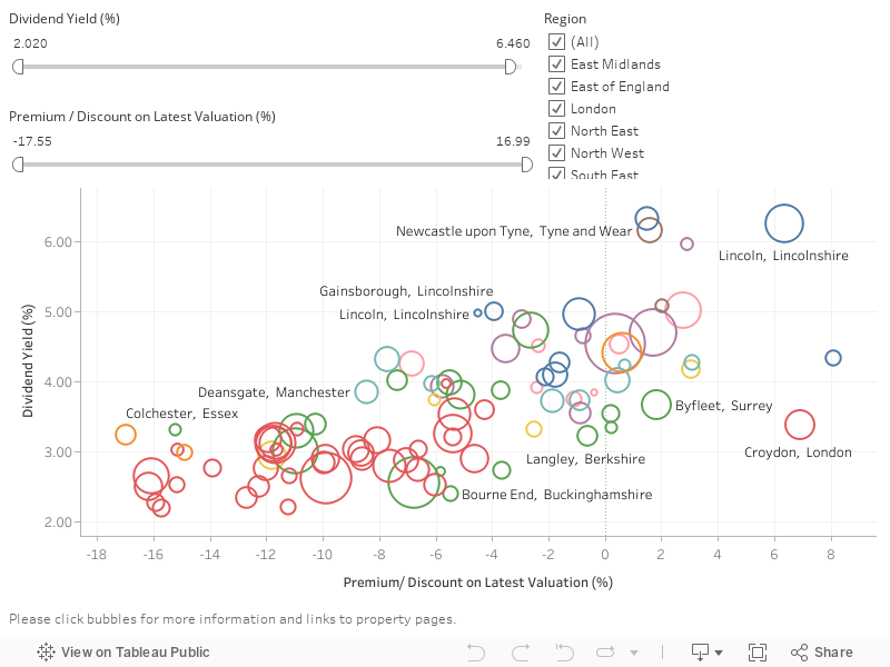
Below is an interactive graph which is updated with live data close to real time from our marketplace.
The graph outlines all investments available on the Resale market, displaying them by three main criteria:
- Dividend Yield (%)
- Premium/Discount on Latest Valuation (%)
- Location by Region
Using the sliders and tool box, you can drill down to find specific properties that meet your investment criteria. You can also click on any individual property circle on the graph, and up pops further detail. There are also direct links to the individual property pages. Take a look below and try it out:
Note: The best way to view this data is on your desktop rather than mobile – simply click full-screen in the bottom corner and start exploring.
Alternatively, should you wish to see the above information in pure data form, you can explore our Data View tool, here.
If there are other tools you’d like, we’d love to hear about them. Feel free to email us any suggestions – we’re always listening.